How things are shaping up Part 2
May 29th, 2015
So last week I wrote about how I was trying to block out buildings and get them into the game quickly to see how they worked. Well this week I continued down that path and got some interesting results. Of all the models I turned out last week the default house was definitely my least favorite, so this week i took another shot at it.
I really liked how the drug store started to look last week after I stopped caring about photo-realism and made everything a little more skewed. My main sources of inspiration were stop motion films like Nightmare Before Christmas, Paranorman, Coraline, Boxtrolls and Frankenweenie. I love the style in these films and I think that’s the route I want to go with Project Zeds. So keeping that in ind I used Tuesday to take another pass at creating a house.
Things that went right:
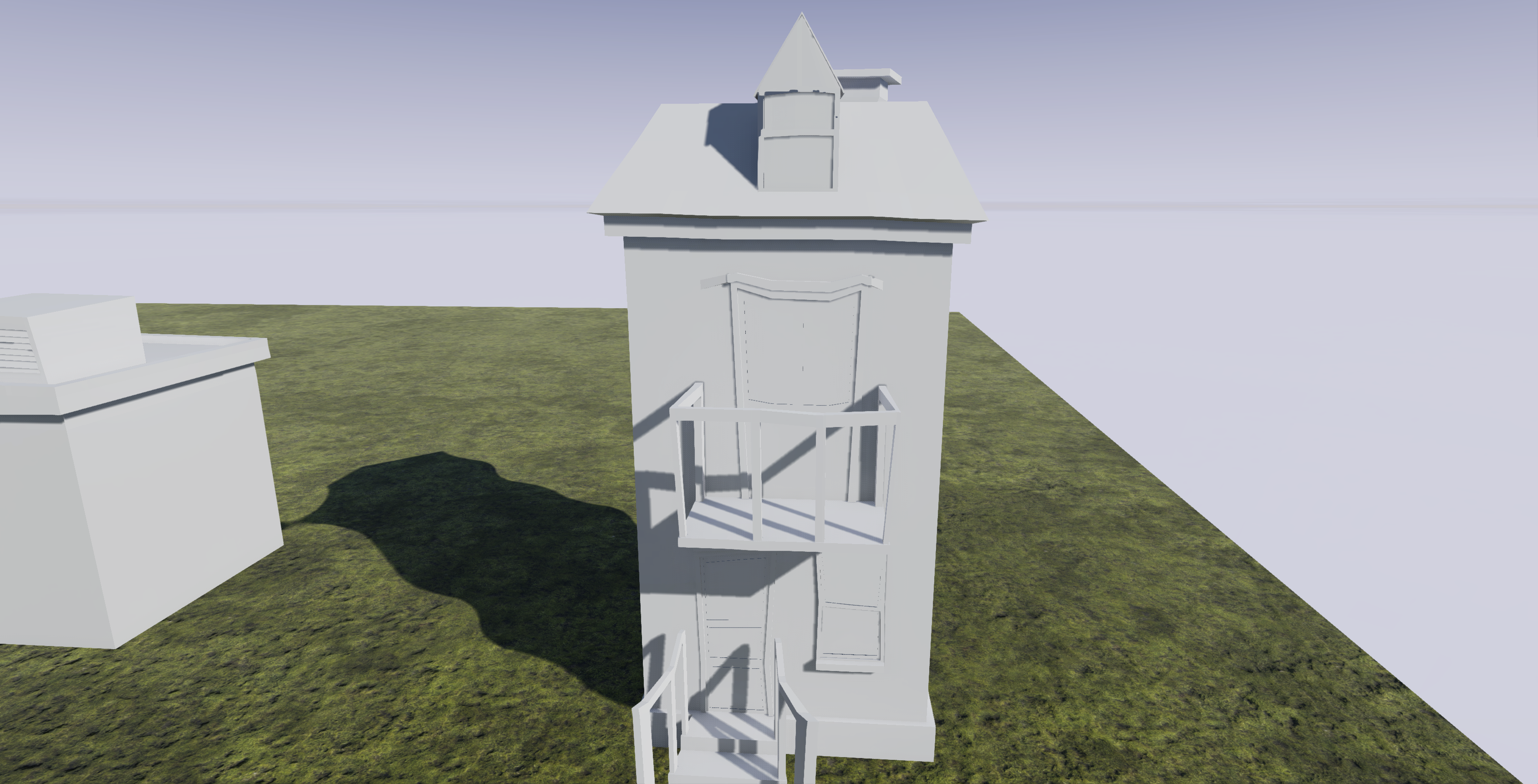
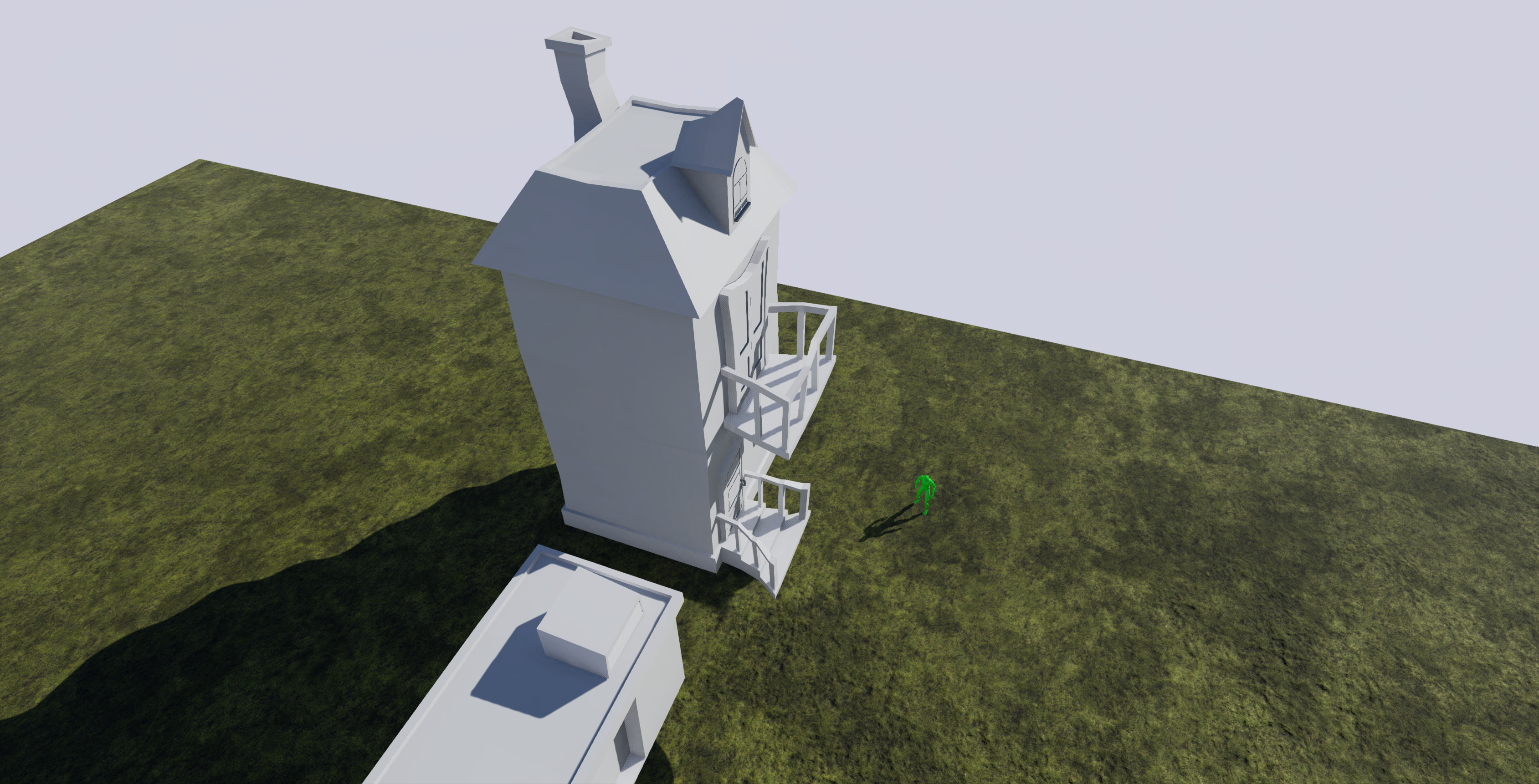
I feel that this building had the most character yet. I decided to go with a skinny two-story house that proportionally makes no sense but is pleasing to the eye. As seeing that in Project Zeds you never actually go inside of buildings It doesn’t make much sense to have them take up a bunch of space.
Things that went wrong:
This model by itself took as much time as all three of the previous models together. All the railings, the windows, and the chimney, forced me to put more detail into this model than I had previously and I’m starting to learn that more and more detail seems to consume time on an exponential level. If that was not bad enough I made a massive mistake when I created the window at the very top of the house. I used a triangle! While this is not that bad of a thing by itself my inexperience with modelling meant that before long all of my edge loops were insane. It got to the point were I had to stop adding detail to the mesh because the topology was just so bad. I had not caught my mistake soon enough and before long the model I had was pretty much unusable.
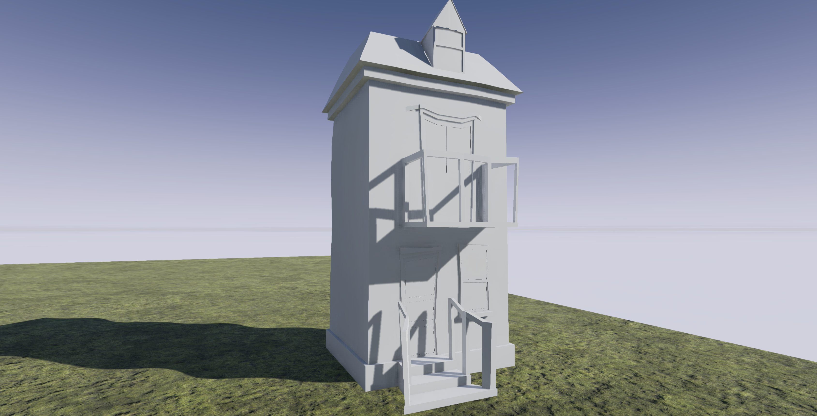
So, like always, on Thursday I had to stat over. This time I tried to keep a few things in mind.
- Keep as much reusable as possible: Windows, Doors, Chimneys, and knobs are things I’m probably going to need over and over again as I model out these towns. There is no reason I should be recreating these every time I start a new building. So what I started doing was creating IMM brushes in Zbrush for generic house parts I’m probably going to need over and over again. I have one for windows, one for doors and a third for miscellaneous. I kept that brush as generic as possible so that after its been applied to my model I can add some character.
- Split up my mesh: I’m curious to hear from some advanced modelers out there on whether this is a good idea or not, but it seems to be helping right now. Originally my house was one big connected mesh. The doors, the windows, the roof were all one piece. This time because I’ve broken each of those pieces out into separate brushes they don’t really share edge loops and aren’t technically connected. I tried to look online to see if this might cause shading errors or anything down the road, but I haven’t found anything yet. I definitely found it much easier to keep my topology clean this way so I hope its and acceptable method.
- Use the original as a blueprint: I didn’t want to redesign the house. I I loved how it looked, I just wanted clean topology. So I used the original house as my design, only changing a few things.
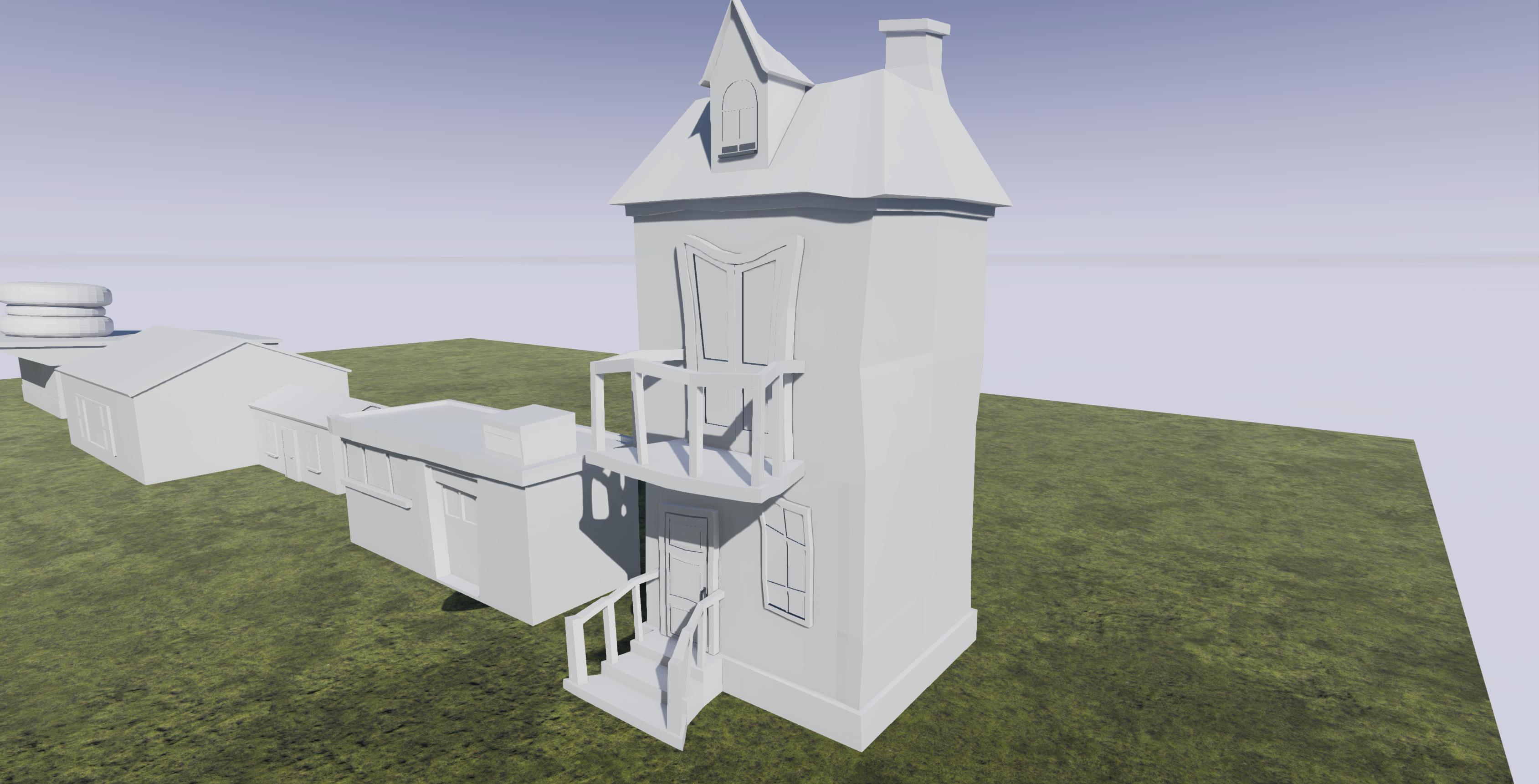
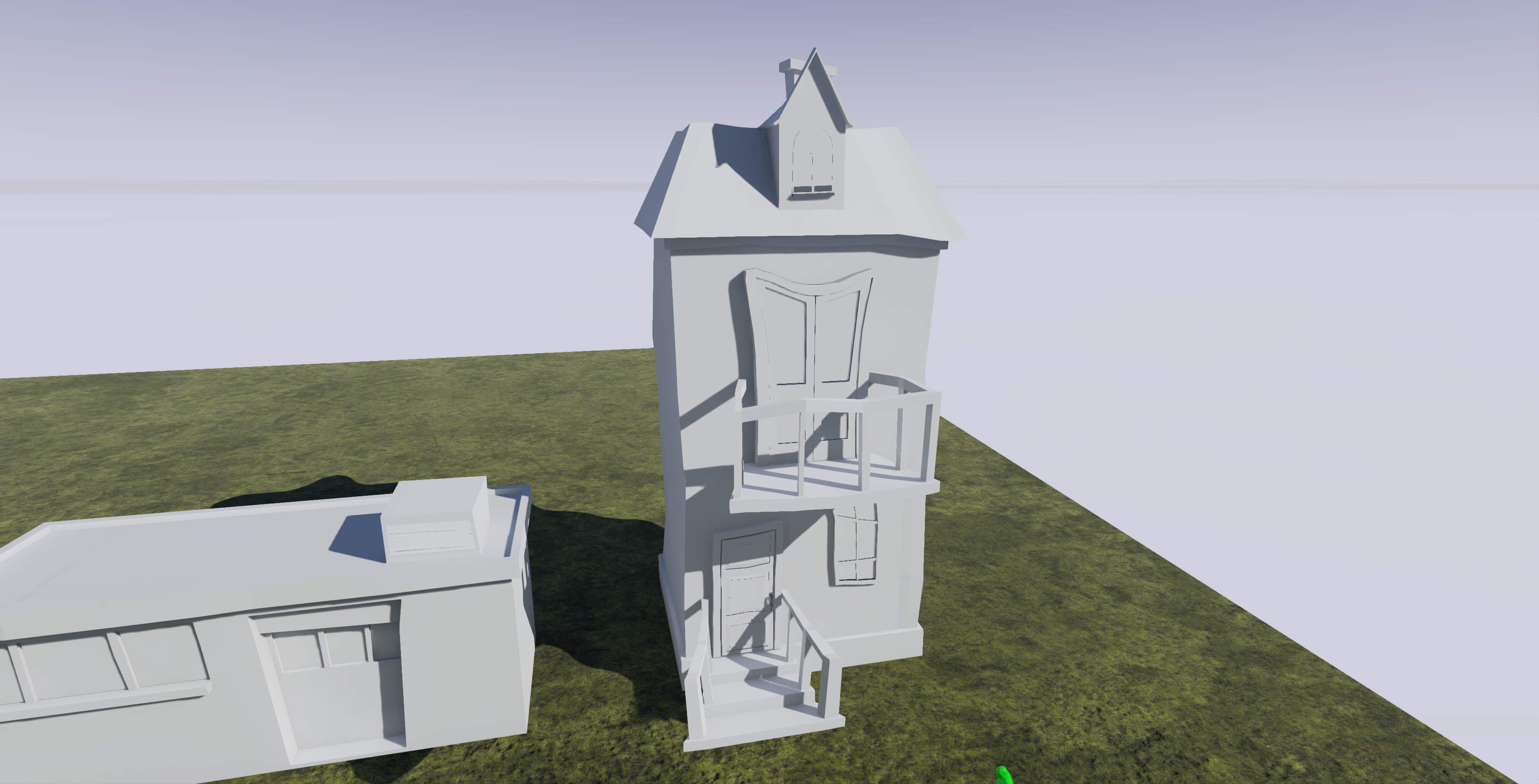
So bellow are images of my final result as well as a sketchfab widget showing the new topology. Let me know what you guys think and feel free to leave comments on my new process.
back to blog